Gravwell has a pretty decent selection of modules and renderers for working with data and visualizing results, but what if you want to go further? For example, Gravwell can calculate standard deviations, but at the present time it can't display error bars in a chart. This blog post will show how you can use some extremely simple code (provided by us, just scroll down!) to pull Gravwell query results into a Jupyter notebook and unleash the full power of Python on your data.
The Query Function: One Token, Over the Line
We've written about Gravwell access tokens and the direct search API before (see this post). Basically, the direct search API can run a full Gravwell query and give you back results all in one HTTP request; you use an access token to authenticate with Gravwell for the request.
The coolest thing about the direct search API is that it's super easy to wire up in any modern programming language: you're just doing an HTTP request with some headers set. Here's a simple little function in Python which hits the direct search API and then parses the results as a Pandas DataFrame:
GravwellServer = "http://gravwell.example.org"
from io import StringIO
import pandas as pd
import requests
import urllib
def query(query, duration='-1h', start='', end=''):
headers = {
"Gravwell-Token": GravwellToken,
"query": query,
"duration": duration,
"start": start,
"end": end,
"format": "csv"
}
if start != '' and end != '':
headers["duration"] = ''
r = requests.post(urllib.parse.urljoin(GravwellServer, '/api/search/direct'), headers=headers)
r.raise_for_status()
df = pd.DataFrame()
if len(r.text) > 0:
df = pd.read_csv(StringIO(r.text), parse_dates=[0], infer_datetime_format=True)
return df
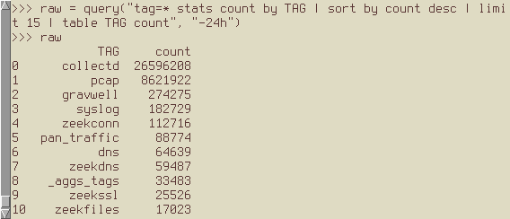
Once I set the GravwellToken and GravwellServer variables, I can just drop that code directly into a Python REPL and run a query:
Bringing in Jupyter
This is where it starts to get fun: because our `query` function is just Python, we can drop it into a Jupyter notebook and do the same thing:
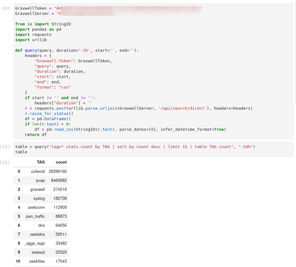
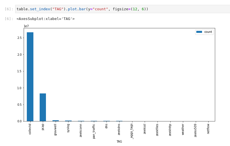
Since the output object (table) is just a Pandas DataFrame, we can call all the usual functions. For instance, we can make a bar chart of the results:
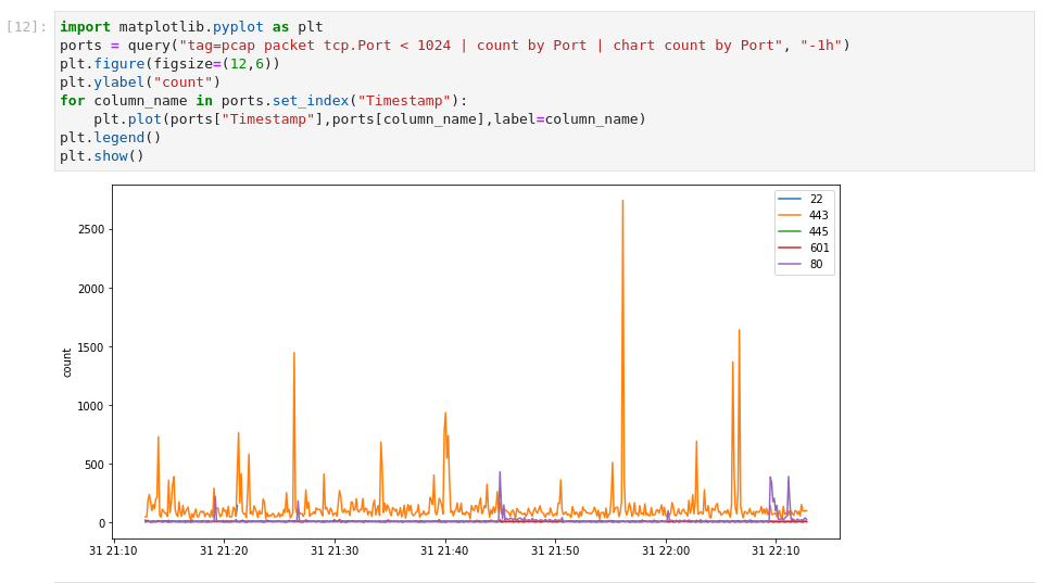
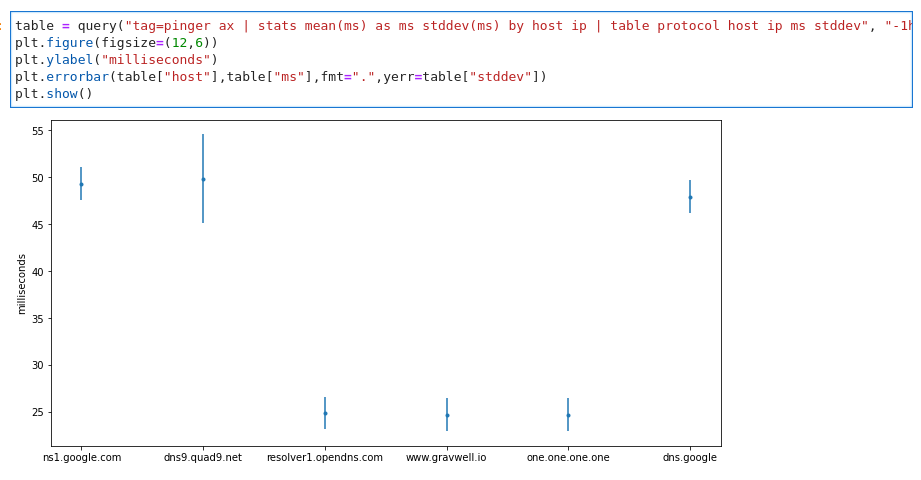
Now, if we prefer, we can import the matplotlib library and use that to generate plots with all sorts of options. Here's a little snippet of code which runs a chart query, then plots the results:
I teased error bars at the start of the post, so here they are too:
The Big Demo
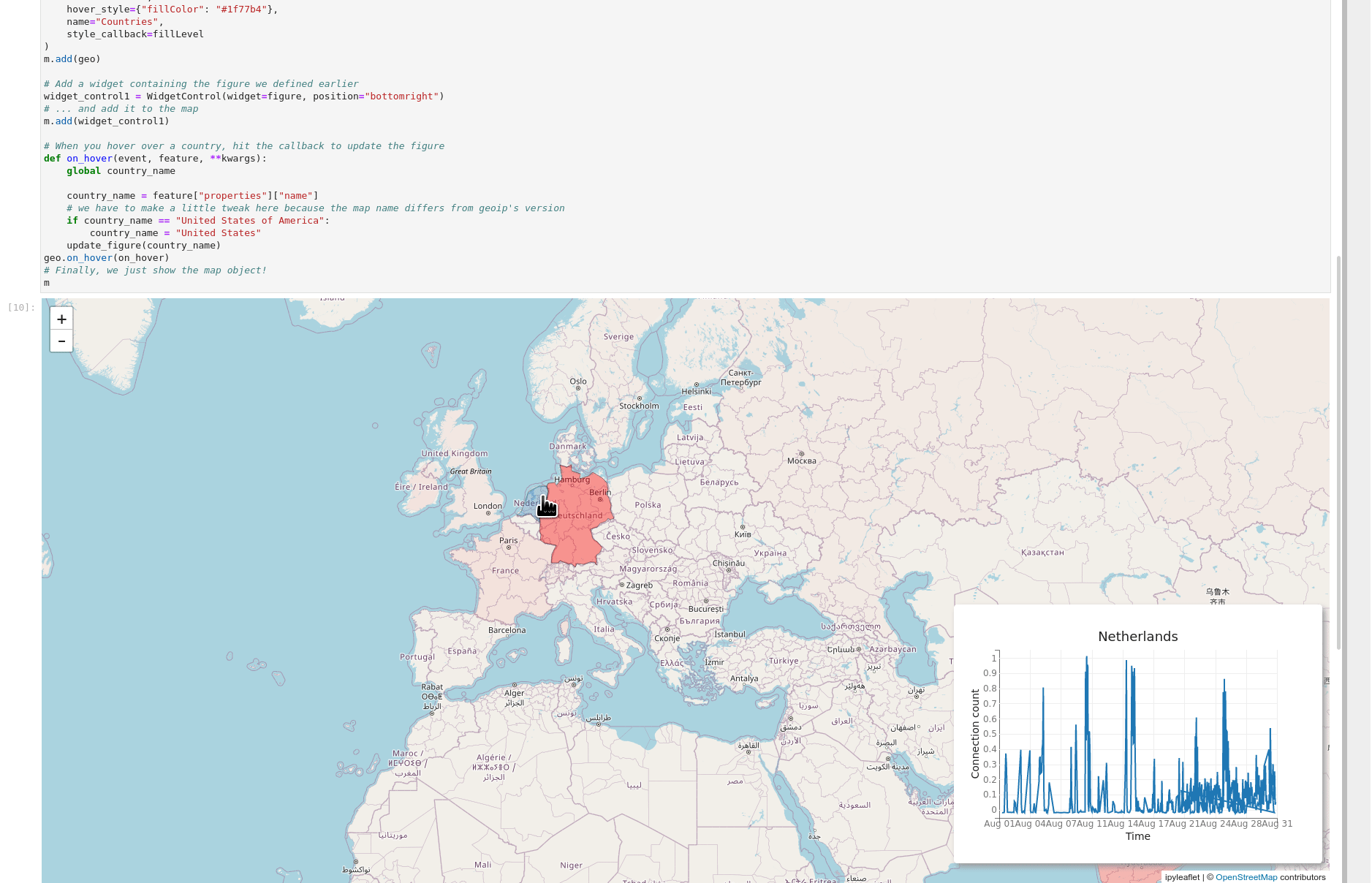
The essential thing to remember about Gravwell and Jupyter is that the results are just data, so go wild--you can jam together all sorts of libraries and get awesome results. In the GIF below, I've used the ipyleaflet library to build an interactive map using Zeek connection log data. When you hover over a country, the inset chart changes to show the number of connections to that country over the month of August.
Try it Yourself
We have a repository up at jupyter gravwell containing Jupyter code for interacting with Gravwell. You can load the query function (implemented in gravwell-lib.ipynb) into any notebook by just including the following cell:
Take a look at example.ipynb for some cool demos, including the map demo shown above! If you don't have Jupyter installed, you can also try the notebook live by visiting mybinder
We hope this inspires you to try interesting and weird new things with Gravwell and Jupyter; if you come up with something you're especially proud of, send us an email and we'll put it on the blog!